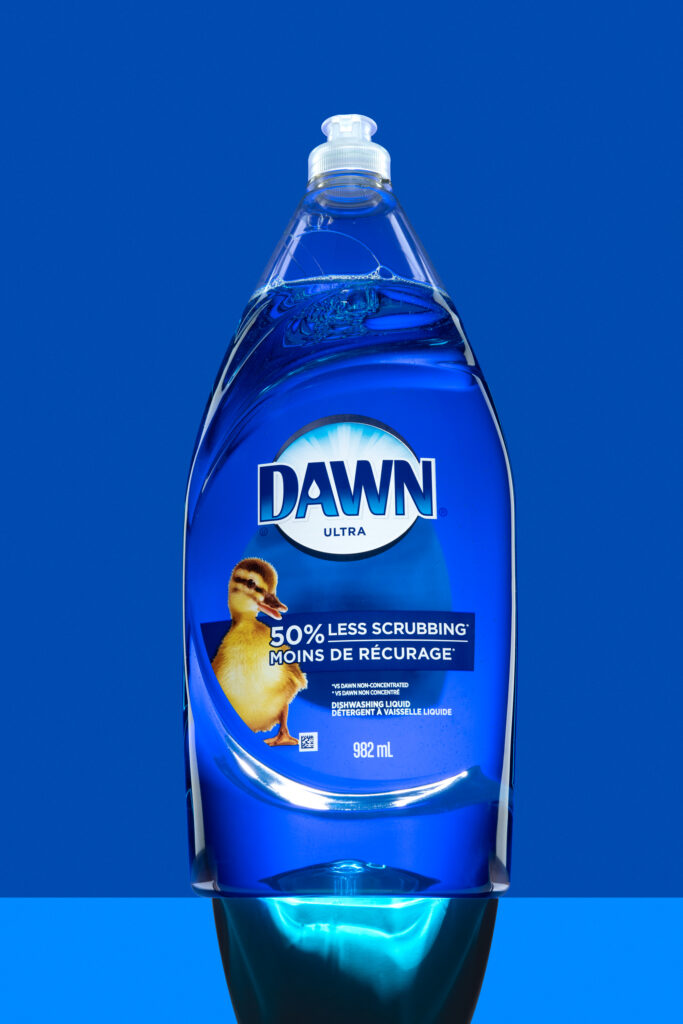
A bold lighting study on everyday cleaning products
Household cleaners do not usually get much attention. This project changes that. Strong shapes, solid color, and precise lighting give presence to something most people ignore.
Team Clean is not a real brand. The name is bad. The label was built in ten minutes. The lighting setup took hours. That is the point.
The challenge was to treat a disposable, made-up product like it matters. Every reflection is shaped. Every shadow is placed. The product reads clearly and holds visual weight.
This is not a joke. It is still life with structure and control. And a reminder that even the most ordinary object can be made to stand out.
