Bold Color. Simple Composition. Clear Intent.
I came across a bright yellow mustard bottle on Facebook and thought it was time to create my own version. A cleaner, more intentional take.
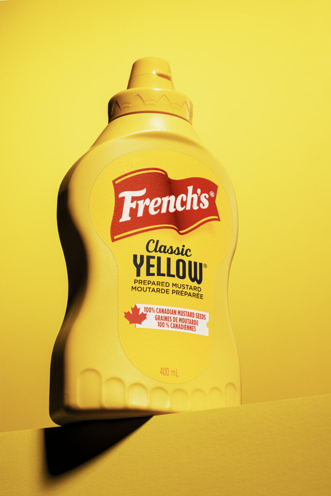
The concept was to build a playful and vibrant image that draws the eye and captures the essence of the brand. French’s yellow bottle, with its bold red and blue label, became the centerpiece. I placed it on a vivid yellow background and angled it slightly forward from a low camera position to bring energy and perspective into the frame.
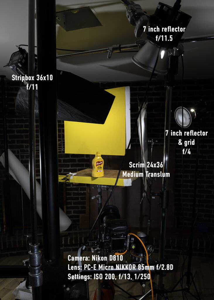
Lighting played a major role. I tested a few setups to highlight the label while keeping the shadows soft and the color tones clean. In commercial product photography, there is no single perfect approach to lighting, but one rule always stands — the label must read clearly.
This image focuses on color impact and composition. The combination of yellow and red is designed to trigger positive emotions and create strong visual presence. It brings a sense of fun, clarity, and shelf appeal.
Did it work? I believe it did.