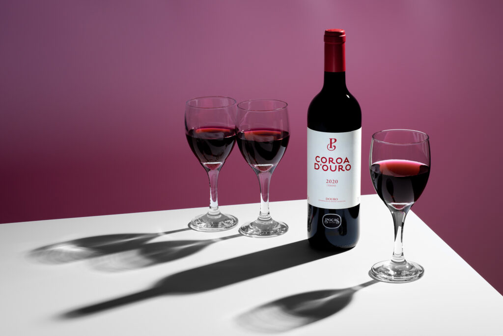
A clean label deserves presence.
This still life series for Coroa d’Ouro was built around contrast and control; sharp light, hard falloff, and deep shadows to give the bottle weight and clarity. Paired with glassware and gradient colour to echo the label’s tone, the result is a sharp set made for packaging, print, and campaign use.
This Coroa d’Ouro red wine campaign focuses on bold shelf presence through rich tones and structured lighting.